Components Basics
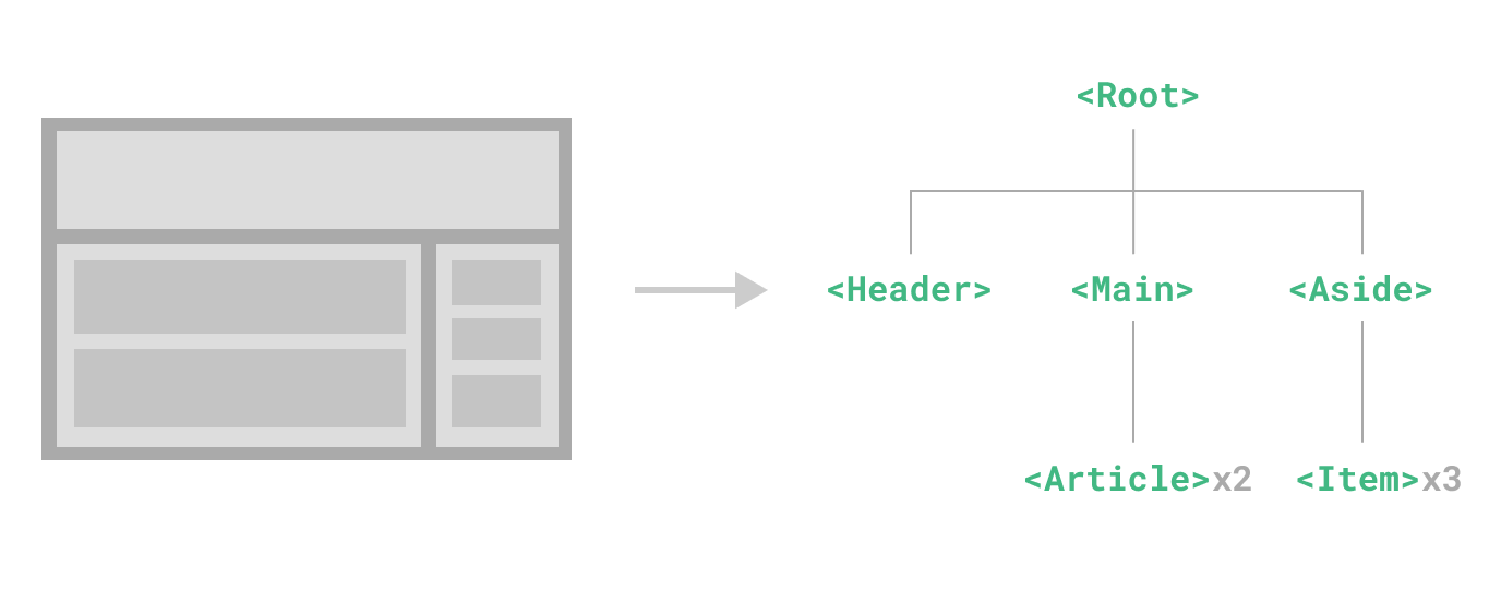
Components allow us to split the UI into independent and reusable pieces, and think about each piece in isolation. It's common for an app to be organized into a tree of nested components:
This is very similar to how we nest native HTML elements, but Vue implements its own component model that allows us to encapsulate custom content and logic in each component. Vue also plays nicely with native Web Components. If you are curious about the relationship between Vue Components and native Web Components, read more here.
Defining a Component
When using a build step, we typically define each Vue component in a dedicated file using the .vue extension - known as a Single-File Component (SFC for short):
vue
<script setup>
import { ref } from 'vue'

const count = ref(0)
</script>

<template>
  <button @click="count++">You clicked me {{ count }} times.</button>
</template>
When not using a build step, a Vue component can be defined as a plain JavaScript object containing Vue-specific options:
js
import { ref } from 'vue'

export default {
  setup() {
    const count = ref(0)
    return { count }
  },
  template: `
    <button @click="count++">
      You clicked me {{ count }} times.
    </button>`
  // Can also target an in-DOM template:
  // template: '#my-template-element'
}
The template is inlined as a JavaScript string here, which Vue will compile on the fly. You can also use an ID selector pointing to an element (usually native <template> elements) - Vue will use its content as the template source.
The example above defines a single component and exports it as the default export of a .js file, but you can use named exports to export multiple components from the same file.
Using a Component
TIP
We will be using SFC syntax for the rest of this guide - the concepts around components are the same regardless of whether you are using a build step or not. The Examples section shows component usage in both scenarios.
To use a child component, we need to import it in the parent component. Assuming we placed our counter component inside a file called ButtonCounter.vue, the component will be exposed as the file's default export:
vue
<script setup>
import ButtonCounter from './ButtonCounter.vue'
</script>

<template>
  <h1>Here is a child component!</h1>
  <ButtonCounter />
</template>
With <script setup>, imported components are automatically made available to the template.
It's also possible to globally register a component, making it available to all components in a given app without having to import it. The pros and cons of global vs. local registration is discussed in the dedicated Component Registration section.
Components can be reused as many times as you want:
template
<h1>Here are many child components!</h1>
<ButtonCounter />
<ButtonCounter />
<ButtonCounter />Notice that when clicking on the buttons, each one maintains its own, separate count. That's because each time you use a component, a new instance of it is created.
In SFCs, it's recommended to use PascalCase tag names for child components to differentiate from native HTML elements. Although native HTML tag names are case-insensitive, Vue SFC is a compiled format so we are able to use case-sensitive tag names in it. We are also able to use /> to close a tag.
If you are authoring your templates directly in a DOM (e.g. as the content of a native <template> element), the template will be subject to the browser's native HTML parsing behavior. In such cases, you will need to use kebab-case and explicit closing tags for components:
template
<!-- if this template is written in the DOM -->
<button-counter></button-counter>
<button-counter></button-counter>
<button-counter></button-counter>
See in-DOM template parsing caveats for more details.
Passing Props
If we are building a blog, we will likely need a component representing a blog post. We want all the blog posts to share the same visual layout, but with different content. Such a component won't be useful unless you can pass data to it, such as the title and content of the specific post we want to display. That's where props come in.
Props are custom attributes you can register on a component. To pass a title to our blog post component, we must declare it in the list of props this component accepts, using the defineProps macro:
vue
<script setup>
defineProps(['title'])
</script>

<template>
  <h4>{{ title }}</h4>
</template>
defineProps is a compile-time macro that is only available inside <script setup> and does not need to be explicitly imported. Declared props are automatically exposed to the template. defineProps also returns an object that contains all the props passed to the component, so that we can access them in JavaScript if needed:
js
const props = defineProps(['title'])
console.log(props.title)
See also: Typing Component Props
If you are not using <script setup>, props should be declared using the props option, and the props object will be passed to setup() as the first argument:
js
export default {
  props: ['title'],
  setup(props) {
    console.log(props.title)
  }
}
A component can have as many props as you like and, by default, any value can be passed to any prop.
Once a prop is registered, you can pass data to it as a custom attribute, like this:
template
<BlogPost title="My journey with Vue" />
<BlogPost title="Blogging with Vue" />
<BlogPost title="Why Vue is so fun" />
In a typical app, however, you'll likely have an array of posts in your parent component:
js
const posts = ref([
  { id: 1, title: 'My journey with Vue' },
  { id: 2, title: 'Blogging with Vue' },
  { id: 3, title: 'Why Vue is so fun' }
])
Then want to render a component for each one, using v-for:
template
<BlogPost
  v-for="post in posts"
  :key="post.id"
  :title="post.title"
/>Notice how v-bind syntax (:title="post.title") is used to pass dynamic prop values. This is especially useful when you don't know the exact content you're going to render ahead of time.
That's all you need to know about props for now, but once you've finished reading this page and feel comfortable with its content, we recommend coming back later to read the full guide on Props.
Listening to Events
As we develop our <BlogPost> component, some features may require communicating back up to the parent. For example, we may decide to include an accessibility feature to enlarge the text of blog posts, while leaving the rest of the page at its default size.
In the parent, we can support this feature by adding a postFontSize ref:
js
const posts = ref([
  /* ... */
])

const postFontSize = ref(1)
Which can be used in the template to control the font size of all blog posts:
template
<div :style="{ fontSize: postFontSize + 'em' }">
  <BlogPost
    v-for="post in posts"
    :key="post.id"
    :title="post.title"
   />
</div>
Now let's add a button to the <BlogPost> component's template:
vue
<!-- omitting <script> -->
<template>
  <div class="blog-post">
    <h4>{{ title }}</h4>
    <button>Enlarge text</button>
  </div>
</template>
The button doesn't do anything yet - we want clicking the button to communicate to the parent that it should enlarge the text of all posts. To solve this problem, components provide a custom events system. The parent can choose to listen to any event on the child component instance with v-on or @, just as we would with a native DOM event:
template
<BlogPost
  ...
  @enlarge-text="postFontSize += 0.1"
 />
Then the child component can emit an event on itself by calling the built-in $emit method, passing the name of the event:
vue
<!-- omitting <script> -->
<template>
  <div class="blog-post">
    <h4>{{ title }}</h4>
    <button @click="$emit('enlarge-text')">Enlarge text</button>
  </div>
</template>
Thanks to the @enlarge-text="postFontSize += 0.1" listener, the parent will receive the event and update the value of postFontSize.
We can optionally declare emitted events using the defineEmits macro:
vue
<script setup>
defineProps(['title'])
defineEmits(['enlarge-text'])
</script>
This documents all the events that a component emits and optionally validates them. It also allows Vue to avoid implicitly applying them as native listeners to the child component's root element.
Similar to defineProps, defineEmits is only usable in <script setup> and doesn't need to be imported. It returns an emit function that is equivalent to the $emit method. It can be used to emit events in the <script setup> section of a component, where $emit isn't directly accessible:
vue
<script setup>
const emit = defineEmits(['enlarge-text'])

emit('enlarge-text')
</script>
See also: Typing Component Emits
If you are not using <script setup>, you can declare emitted events using the emits option. You can access the emit function as a property of the setup context (passed to setup() as the second argument):
js
export default {
  emits: ['enlarge-text'],
  setup(props, ctx) {
    ctx.emit('enlarge-text')
  }
}
That's all you need to know about custom component events for now, but once you've finished reading this page and feel comfortable with its content, we recommend coming back later to read the full guide on Custom Events.
Content Distribution with Slots
Just like with HTML elements, it's often useful to be able to pass content to a component, like this:
template
<AlertBox>
  Something bad happened.
</AlertBox>
Which might render something like:
This is an Error for Demo Purposes
Something bad happened.
This can be achieved using Vue's custom <slot> element:
vue
<template>
  <div class="alert-box">
    <strong>This is an Error for Demo Purposes</strong>
    <slot />
  </div>
</template>

<style scoped>
.alert-box {
  /* ... */
}
</style>
As you'll see above, we use the <slot> as a placeholder where we want the content to go – and that's it. We're done!
That's all you need to know about slots for now, but once you've finished reading this page and feel comfortable with its content, we recommend coming back later to read the full guide on Slots.
Dynamic Components
Sometimes, it's useful to dynamically switch between components, like in a tabbed interface:
The above is made possible by Vue's <component> element with the special is attribute:
template
<!-- Component changes when currentTab changes -->
<component :is="tabs[currentTab]"></component>
In the example above, the value passed to :is can contain either:
- the name string of a registered component, OR
- the actual imported component object
You can also use the is attribute to create regular HTML elements.
When switching between multiple components with <component :is="...">, a component will be unmounted when it is switched away from. We can force the inactive components to stay "alive" with the built-in <KeepAlive> component.
in-DOM Template Parsing Caveats
If you are writing your Vue templates directly in the DOM, Vue will have to retrieve the template string from the DOM. This leads to some caveats due to browsers' native HTML parsing behavior.
TIP
It should be noted that the limitations discussed below only apply if you are writing your templates directly in the DOM. They do NOT apply if you are using string templates from the following sources:
- Single-File Components
- Inlined template strings (e.g.
template: '...') <script type="text/x-template">
Case Insensitivity
HTML tags and attribute names are case-insensitive, so browsers will interpret any uppercase characters as lowercase. That means when you’re using in-DOM templates, PascalCase component names and camelCased prop names or v-on event names all need to use their kebab-cased (hyphen-delimited) equivalents:
js
// camelCase in JavaScript
const BlogPost = {
  props: ['postTitle'],
  emits: ['updatePost'],
  template: `
    <h3>{{ postTitle }}</h3>
  `
}
template
<!-- kebab-case in HTML -->
<blog-post post-title="hello!" @update-post="onUpdatePost"></blog-post>
Self Closing Tags
We have been using self-closing tags for components in previous code samples:
template
<MyComponent />This is because Vue's template parser respects /> as an indication to end any tag, regardless of its type.
In in-DOM templates, however, we must always include explicit closing tags:
template
<my-component></my-component>This is because the HTML spec only allows a few specific elements to omit closing tags, the most common being <input> and <img>. For all other elements, if you omit the closing tag, the native HTML parser will think you never terminated the opening tag. For example, the following snippet:
template
<my-component /> <!-- we intend to close the tag here... -->
<span>hello</span>
will be parsed as:
template
<my-component>
  <span>hello</span>
</my-component> <!-- but the browser will close it here. -->
Element Placement Restrictions
Some HTML elements, such as <ul>, <ol>, <table> and <select> have restrictions on what elements can appear inside them, and some elements such as <li>, <tr>, and <option> can only appear inside certain other elements.
This will lead to issues when using components with elements that have such restrictions. For example:
template
<table>
  <blog-post-row></blog-post-row>
</table>
The custom component <blog-post-row> will be hoisted out as invalid content, causing errors in the eventual rendered output. We can use the special is attribute as a workaround:
template
<table>
  <tr is="vue:blog-post-row"></tr>
</table>
TIP
When used on native HTML elements, the value of is must be prefixed with vue: in order to be interpreted as a Vue component. This is required to avoid confusion with native customized built-in elements.
That's all you need to know about in-DOM template parsing caveats for now - and actually, the end of Vue's Essentials. Congratulations! There's still more to learn, but first, we recommend taking a break to play with Vue yourself - build something fun, or check out some of the Examples if you haven't already.
Once you feel comfortable with the knowledge you've just digested, move on with the guide to learn more about components in depth.